Autism Infographic: A Visual Guide to Understanding Autism Spectrum Disorder

Medically reviewed by Laura Athey Updated Date: May 4, 2026
In my clinical practice, I have often found that a single, well-designed autism infographic can communicate more to a overwhelmed parent or a newly diagnosed adult than a fifty-page diagnostic report.
I recall a session with a patient, “Mark,” who struggled to explain his sensory needs to his employer. We sat down and sketched out a simple visual map of his triggers—fluorescent lights, high-pitched hums, and open-plan seating.
Seeing his experience laid out visually changed his perspective from “I am failing” to “My environment is mismatched.”
What is an autism infographic? At its core, it is a visual synthesis of complex neurodevelopmental data. Whether used for autism awareness, education, or self-advocacy, these tools break down the autism spectrum into digestible panels.
A common point of confusion I see is the question: “Is ASD autism?” Yes—Autism Spectrum Disorder (ASD) is the formal clinical term used in the DSM-5, while “autism” remains the community’s preferred identity-first language.
This guide provides a visual roadmap of the symptoms, types, and evolving data surrounding the spectrum in 2026.
Autism Definition and Core Symptoms
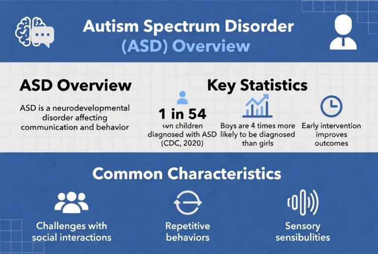
Understanding the autism definition requires looking past outdated stereotypes and focusing on how the brain processes information. In clinical settings, we utilize the autism symptoms chart to identify the two “pillars” of ASD as defined by the DSM-5-TR.
What Are the 3 Main Symptoms of Autism?
While the DSM-5 groups traits into two categories, many educators prefer the “Triad of Impairments” or a three-pronged autism characteristics chart:
- Social Communication Differences: This includes difficulty with “social-emotional reciprocity,” such as back-and-forth conversation, and challenges understanding non-verbal cues like eye contact or body language.
- Restricted and Repetitive Behaviors: This encompasses “stimming” (repetitive movements), an insistence on sameness (routines), and highly fixed, intense interests.
- Sensory Processing Differences: Hyper-reactivity (over-sensitivity) or hypo-reactivity (under-sensitivity) to sensory input, such as the texture of clothing or the volume of a crowded room.
An effective autism spectrum disorder chart should use color-coding to separate these domains, making it easier for visual learners to identify where their specific challenges or strengths lie.
Autism Examples Across the Lifespan
Autism is a lifelong developmental difference, but its “look” changes as we age. An autism infographic for kids will focus on developmental milestones, whereas an adult autism infographic must account for decades of masking and compensation.
- Early Childhood: Lining up toys instead of playing “pretend,” delayed speech, or intense distress at minor routine changes.
- Teens: Social exhaustion, difficulty navigating the “unwritten rules” of high school, and a deep preference for digital or interest-based communication.
- Adulthood: Workplace burnout, “social hangovers” after meetings, and the use of scripts to get through grocery store transactions.
Visualizing these autism examples in a chronological panel helps families see that while the core neurology remains the same, the support needs evolve.
Autism Types and Presentations
The way we categorize autism types has shifted dramatically. Previously, terms like “Asperger’s Syndrome” or “PDD-NOS” were used to distinguish “high-functioning” individuals. Today, these are all under the umbrella of ASD.
Is ASD Autism?
Yes. The shift to a single diagnosis was intended to ensure that individuals with “subtle” presentations (who might have been called Asperger’s) still receive access to support. An autism infographic today often uses a “spectrum wheel” rather than a linear bar.
This wheel shows that an individual can have high support needs in sensory processing but low support needs in verbal communication.
Female Autism & Autism in Girls

For a long time, the “face” of autism was a young boy. This led to a massive diagnostic gap for women and girls. A female autism infographic is an essential tool for correcting this bias.
- Masking: Autistic girls are often socialized to be “people pleasers,” leading them to mimic neurotypical peers more effectively than boys.
- Internalizing: Instead of “acting out,” autistic girls often internalize their distress as anxiety, depression, or eating disorders.
- Interests: Their “special interests” may be more socially acceptable (like horses, celebrities, or psychology) and thus go unnoticed by teachers.
A visual comparison chart showing the “Externalized” (male-typical) vs. “Internalized” (female-typical) presentation is one of the most requested resources in my clinic.
PDA Autism Infographic
Pathological Demand Avoidance (PDA)—increasingly referred to by the community as Pervasive Drive for Autonomy—is a specific profile of autism that requires a unique visual approach.
A PDA autism infographic should focus on the Anxiety-Avoidance Cycle. Unlike a child who is “being defiant,” a PDA individual experiences a “demand” (even something they want to do) as a threat to their nervous system.
The visual representation usually shows a “threat response” being triggered by a simple request, leading to an autonomic “freeze” or “fight” reaction. It is important to note that PDA is not yet a separate diagnosis in the DSM, but it is a widely recognized profile in neurodiversity-affirming care.
Sensory Autism Infographic
Sensory processing is often the most misunderstood part of the autistic experience. A sensory autism infographic should illustrate the “Sensory Cup” concept.
- Hyper-sensitivity (The Full Cup): The individual feels “too much.” A light touch feels like a burn; a distant fan sounds like a jet engine.
- Hypo-sensitivity (The Empty Cup): The individual feels “too little.” They may seek out deep pressure, loud music, or constant movement to “feel” their body in space.
Visualizing regulation strategies—such as noise-canceling headphones, weighted blankets, or “sensory diets”—provides a toolkit for those living with these differences.
ADHD vs Autism Infographic
The overlap between ADHD and autism is so high (estimated between 50-70%) that the community has coined the term “AuDHD.” However, an adhd vs autism infographic is helpful for distinguishing the “why” behind behaviors.
- Shared Traits: Executive dysfunction, sensory sensitivities, and hyper-focus.
- Differences: In ADHD, social challenges are often due to impulsivity or inattention. In Autism, social challenges are usually due to a difference in processing social cues and reciprocity.
- Visual Idea: Use a Venn diagram to show where the two conditions meet and where they diverge.
What Is Autism Caused By?
When patients ask, “What is autism caused by?”, it is vital to lead with evidence and empathy. An autism infographic on causes should be a “fact-checker” for common misinformation.
- Genetics: Autism has a heritability rate of roughly 80-90%. It is primarily a difference in how the brain is “wired” during prenatal development.
- Brain Development: Research shows differences in the “pruning” of neurons, leading to a brain that is highly connected in certain areas.
- The Environment: Certain prenatal factors (like maternal health or specific medications) may play a role, but the vaccine myth has been thoroughly debunked by every major medical body.
Autism Rates Over Time (2015–2025)
When looking at an autism chart by year, the most striking feature is the upward trend. This often leads to the question: “Is there an autism epidemic?” The answer, as visualized in a timeline infographic, is that we are simply getting better at seeing what was always there.
- 2015–2017: Prevalence was roughly 1 in 68 children. During this period, infographics focused on “early signs” in toddlers.
- 2019–2021: The rate moved toward 1 in 54. We began to see more adult autism infographics as awareness of “masking” grew.
- 2023–2025: Current CDC data shows rates around 1 in 36. This spike is largely attributed to better screening in minority communities and girls, who were historically overlooked.
This trend doesn’t represent a change in human biology, but a change in the “diagnostic net.” A visual timeline helps illustrate that as awareness goes up, the “hidden” population of neurodivergent people goes down.
Autism by Geography: Rates by State & Country
If you look at an autism by state map or an autism rates by country map, you will notice significant “heat maps” in certain areas. This data is often misinterpreted.
- Higher Rates in Certain States: States like New Jersey often show higher rates not because there is “more autism” there, but because they have some of the best screening and education resources in the country.
- Global Variability: In a global infographic, you might see lower rates in developing nations. This usually correlates with a lack of healthcare access or high cultural stigma, rather than a lack of autistic people.
Visualizing this data as a choropleth map helps policymakers see where “diagnostic deserts” exist—areas where children are likely going unsupported simply because of their zip code.
How to Create an Autism Infographic
As a psychologist, I often advise teachers and parents on how do you create an autism infographic that is actually helpful. Not all visuals are created equal; in fact, a cluttered or poorly designed graphic can be overwhelming to an autistic person.
Step-by-Step Design Guide
- Define the Audience: An autism infographic for kids should use friendly icons and minimal text. A professional guide for employers should focus on data and accommodations.
- Use High Contrast: Many neurodivergent people have visual processing differences. Ensure text is clear and backgrounds are not “busy.”
- Incorporate Visual Supports: Can visual supports be used in an infographic about autism? Absolutely. Use symbols (like the infinity loop for neurodiversity) that the community identifies with, rather than controversial symbols like the puzzle piece.
- Cite Reputable Sources: Always link to organizations like the CDC, ASAN, or the National Autistic Society.
Accessibility Tips
- Avoid Over-Stimulation: Don’t use neon colors or flashing GIFs.
- Clear Hierarchy: Use bold headers and “Z-pattern” layouts so the eye knows where to go next.
- Plain Language: Avoid clinical jargon unless you define it immediately.
Autism in Adults: Late Diagnosis Visual Guide

The fastest-growing area of neurodivergent study is the “late-diagnosed adult.” An adult autism infographic serves as a mirror for those who spent forty years wondering why they felt “alien.”
- The Masking Panel: Illustrate the “internal cost” of pretending to be neurotypical—chronic fatigue, migraines, and identity loss.
- Workplace Support: Use icons to show simple accommodations: noise-canceling headphones, flexible hours, and written vs. verbal instructions.
- The Burnout Cycle: A circular graphic showing how “trying harder” leads to “collapsing,” which is often misdiagnosed as standard clinical depression.
Visualizing these concepts helps adults realize that their struggles are physiological and valid, which is the first step toward healing.
Frequently Asked Questions
Is ASD the same as autism?
Yes. ASD (Autism Spectrum Disorder) is the umbrella medical term. In an autism infographic, it is best to use both terms to ensure people searching for medical data and community support find what they need.
What are the three main symptoms of autism?
The “Triad” usually refers to social communication challenges, restricted/repetitive behaviors, and sensory processing differences.
What causes autism?
It is primarily genetic (80-90% heritability). It is a structural difference in brain development, not something caused by parenting or vaccines.
Why are autism rates increasing?
Because we have broadened the diagnostic criteria and improved our ability to identify women, girls, and adults who were previously missed.
How do you design an autism infographic?
Keep it simple, use high-contrast colors, avoid sensory “clutter,” and focus on strengths-based language rather than a “deficit” model.
Conclusion: Visibility is Validation
Whether you are looking at an autism infographic 2015 to see how far we’ve come, or searching for an autism infographic 2025 to find the latest support strategies, remember that these visuals are more than just data. They are a way of making the invisible visible.
For my patient Mark, that simple sketch of his sensory needs didn’t just get him a quiet office—it gave him his confidence back. When we map out the spectrum, we aren’t just labeling people; we are providing a blueprint for a world that finally makes room for every kind of mind.
References
- Centers for Disease Control and Prevention (CDC).
- National Autistic Society.
- Autistic Self Advocacy Network (ASAN).
- The Lancet Child & Adolescent Health.
Related Posts


Subscribe to Our Newsletter
Get mental health tips, updates, and resources delivered to your inbox.
MORE from Author
Read More In my practice as a clinical psychologist, I often observe that the difference between a patient who crumbles under pressure…
 We all have "up" days and "down" days. Perhaps you feel energized after a promotion or sluggish on a rainy…
 To define bipolar disorder accurately, we must look at it as a chronic mood dysregulation condition. In psychology and medicine,…
 To answer whether bipolar fits the bill, we first have to define what a neurodivergent person actually is. The term…
Are you looking for a Therapist?
Connect with qualified mental health professionals who understand
bipolar disorder, mood changes, and emotional challenges.
Private • Supportive • Confidential